Information Graphics are increasingly visible, not just because they can be appealing to look at, but because we’re reading less and flitting more. Information needs to be engaging, pithily informative, and able to catch a reader’s attention within a few (fractions of) seconds. The internet belongs to the instant gratification generation, and to reach them, it’s necessary to provide information in a way that can be absorbed quickly. Beyond that, a bit of hands-on (or eyes-on) learning can absorb a few key ideas or politically focussed facts more readily than from reading any amount of dry paragraphs.
Hands up who just clicked those links.
Squeezing meaning and messages into ever smaller spaces is creating a need to classify types of interface, data representation and other criteria.
We know a chart showing changes in the base interest rates will be useful to visualize a complex monetary policy issue. We also know that signage is important to help people move through architectural space. But when is an interactive information graphic of most benefit for its target audience? And which style of graphic is going to provide that information in the most informative, and engaging way?
As part of my work with Business21C last year, I looked into at a broad range of information graphics and settled on a classification of eight different types. The presentation PDF is downloadable here shows the examples. And below are the categories with a brief description of each along with reference links.
1. Static graphs and charts
Standard pie charts to scatter plots or line graphs, represent basic information in a conceptual snapshot. Whilst these are standard for annual reports, they become more interesting when they reveal patterns in the data. The convergence of separate science disciplines upon neuroscience research around 2005, created by the Well-formed.eigenfactor project, is one such striking example. And a little artful whimsy is always worthwhile, including the qualitative emotional approach that Jessica Hagy communicates with.
2. Interactive graphs and charts
Providing interaction opens up graphs and charts to exploration on the part of the user. The scatter plots of world poverty over time shown at TED by Hans Rosling, and now made available to everyone through the Google Code APIs, revealed a new way of understanding poverty trends. At the New York Times interaction lets the user cut and slice new views of the data to understand correlations between class, income and occupation. And at Business21C we’ve been plotting the changes in the base interest rate, giving explanations for the decisions made by the Reserve Bank of Australia. Whilst these graphs and charts are simple, they are more engaging as an explanatory tool when well thought out interaction with the data set is enabled.
3. Cartography
We represent the world around us in terms of its actual spatial measurements in many different ways. Before the accuracy of satellite measurements, the fallible calculations of human observation gave us maps such as Ptolemy’s. But even now, unfurling the globe onto flat surfaces brings the conceptual distortion of a chosen map projection. An equal land area projection gives a different emphasis than when straightening the latitude and longitude lines, causing a massive distortion of the land area around the poles but very little at the equator. Our fascination and requirement for cartography also extends out into the solar system and the rest of the universe, so it’s good to see Google Earth providing us with the interface to view this data.
4. Quantitative pictograms and mapping
When we need to represent quantities of things, and where those quantities are located, we use symbols, quantitative pictograms and mapping. I’ve separated mapping from cartography in this context as it’s primarily the quantitative data that’s being represented via the mapping. That occasionally involves distortions of the geography to represent the numbers to dramatic effect. These types of information graphics can become both deeply informative and also beautiful when revealing remoteness from major cities across the world, or how long the Earth’s resources will last.
5. Data feed mashups
Thanks to programming interfaces provided by Google Maps or Flickr or Twitter and many others, it is possible to combine geographical, social, news, interactive or business data into totally new forms, that create dynamic views of the way we live and the world we live in. The ABC in Australia did this beautifully following the 2009 Black Saturday bush fire emergency. Trendsmap show us the most discussed issues across the world rising out of the Twittersphere. And Trulia Snapshot show houses for sale across the United States.
6. Typographic-pictographic narratives
The revolution of pictograms that flowed from the ISOTYPE movement, has given us extended ways to visualise and represent concepts. Typographic layout and emphasis has been a tool of meaning for centuries. In the last few years, thanks to the explosion of online video, we’ve seen the evolution of a new expositional combination of typography, pictograms and other symbolic imagery to unwrap a spoken narrative behind them. One of the first in this category was What Barry Says, in 2004, which used a graphic language from El Lissitzky to enhance the sinister truth of its message. The delightful Le Grande Content borrowed the qualitative diagramming whimsy from the Indexed Blog. And Jonathan Jarvis from Google’s Design Labs aimed to name this technique via his example of The New Mediators.
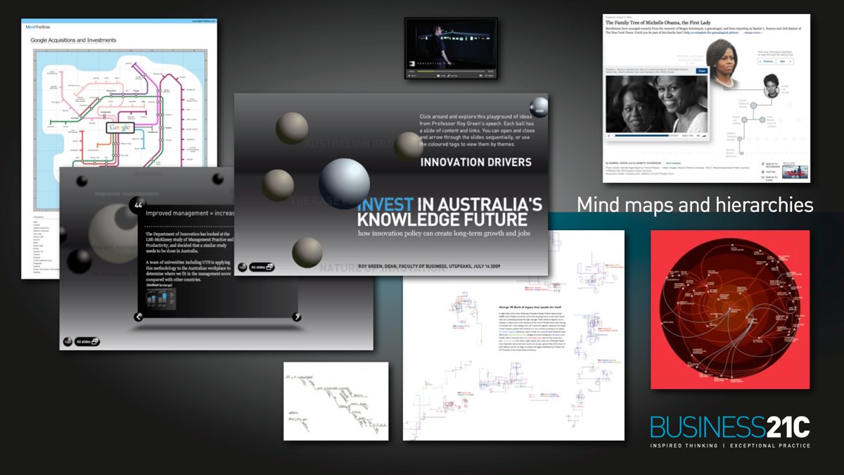
7. Mind maps and hierarchies
When the inter-relationships between points of data or concepts are the key element of a message, then the visualisation needs to focus on communicating that structure. Mind maps express a free-form of this kind, and lend themselves well to hyperlinking and tagging. They open the connections to the user, allowing them to browse the narrative according to their interests. At Business21C we developed a concept map of Professor Roy Green’s Innovation speech in 3D space. The New York Times have an interactive graphic, combining the hierarchy of a Michelle Obama’s family tree with story telling around her life. The BBC show the interconnections of computer pioneers. And Visual Thesaurus show the relationships between comparative words.
8. Data art
With data art, the aesthetic form, or underlying concept, usually matters more than the data set. A few examples come from Reza Ali’s 3D Dewey Data Visualisation, Matthias Dittrich’s Narratives 2.0, and the emotive flow of We Feel Fine. Aesthetics are crucial for all good Information Graphics, which is why we see projects like Wordle making user-submitted clouds of pleasing typography.
Whilst putting this together I came across a lot of excellent online resources. Below are just a few of the more inspiring and informative websites on this subject.
Infosthetics
Visual Complexity
Infographics Depot of Information Graphics
Information is beautiful
Good magazine transparency project
An interview with the New York Times graphic team
If you have any thoughts on other ways to classify this kind of material, for the sake of greater insight, please drop me an email or a comment.

Scott David leads User Experience strategy and design at the World Economic Forum, across their digital platforms for data-driven knowledge and communities of global leadership.